
A Better Note Editing Experience
What's New in Vist - May Edition

I shipped a batch of editor changes to Vist last week. Nothing earth-shattering - no AI agent that writes your thesis while you sleep, no blockchain… just the kind of quiet improvements you only notice when they stop annoying you. This post is about those.
The student
One of our early beta users is a student. Their workflow goes roughly like this: chat with ChatGPT until something coherent falls out, copy the markdown into a Vist note, edit it down into something they actually understand (or that sounds like them), and then present it to their mentor.
That last step is where things were embarrassing. “Full-page” mode used to be 80% of the viewport, which is a polite way of saying “not full anything.” If you have ever tried to present a note to a mentor with a sidebar visible and your unread count blinking at them, you know the specific kind of shame I am describing.
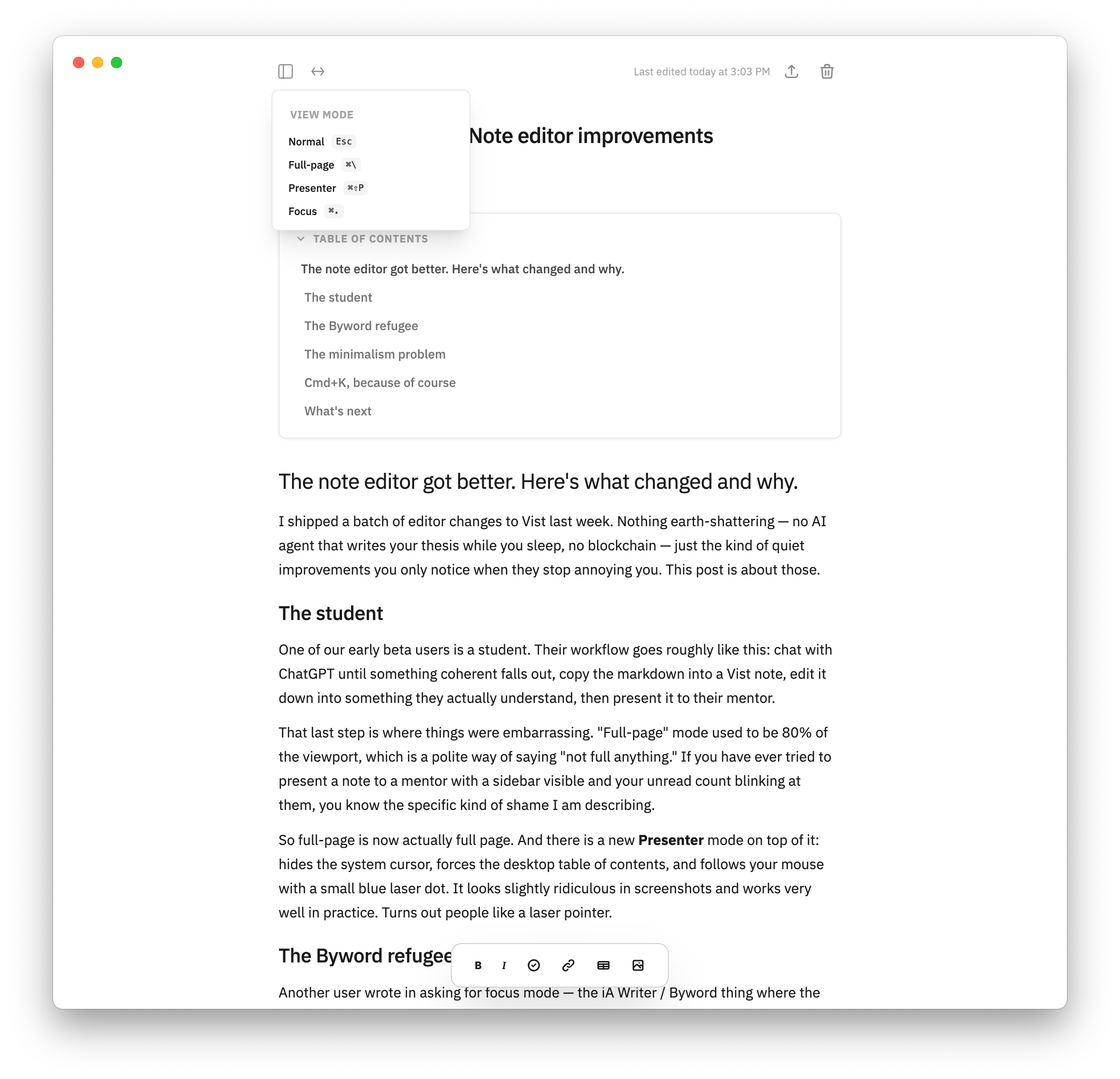
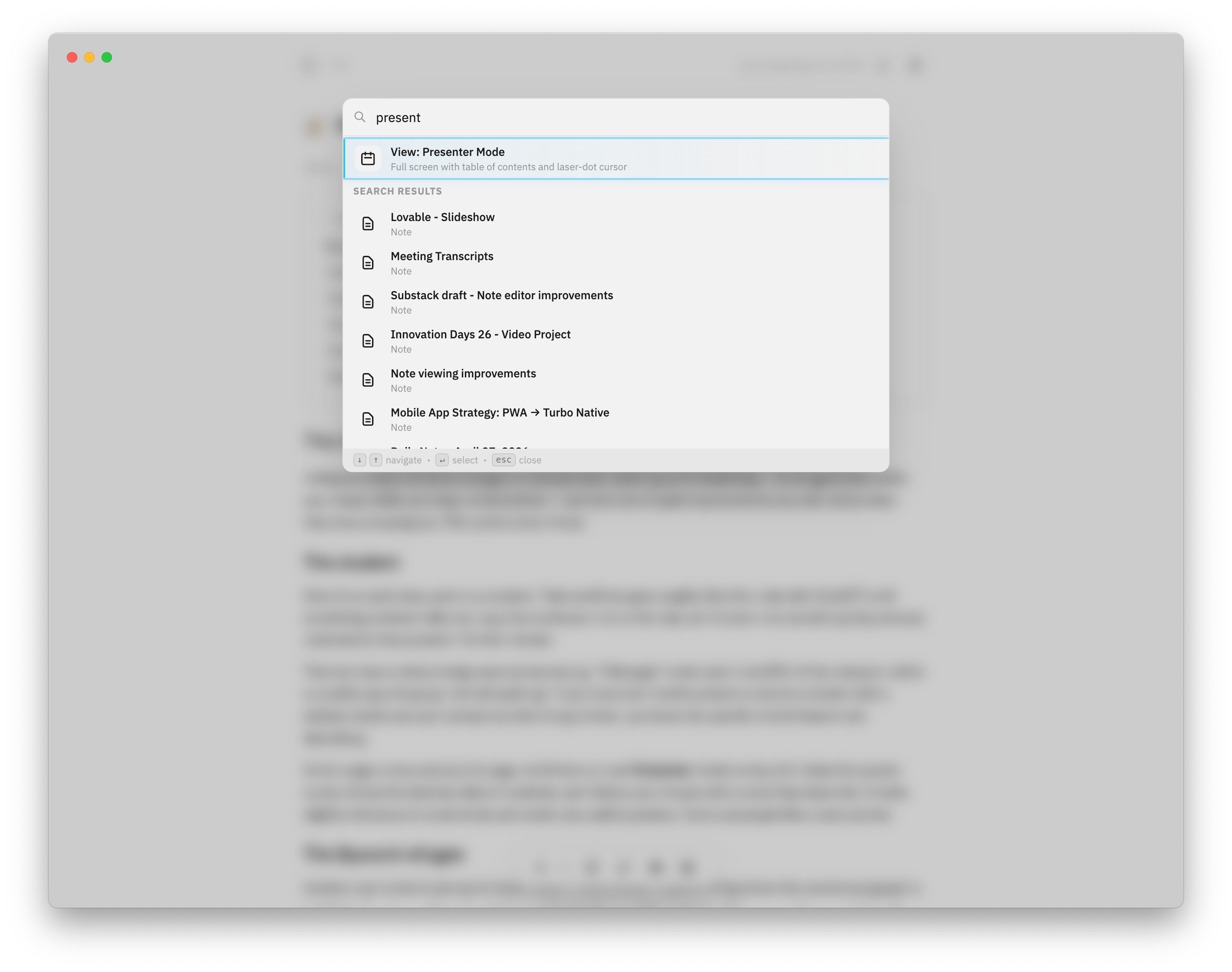
So full-page is now actually full page. And there is a new Presenter mode on top of it: hides the system cursor, forces the desktop table of contents, and follows your mouse with a small blue laser dot. It looks slightly ridiculous in screenshots and works very well in practice. Turns out people like a laser pointer.
The Byword refugee
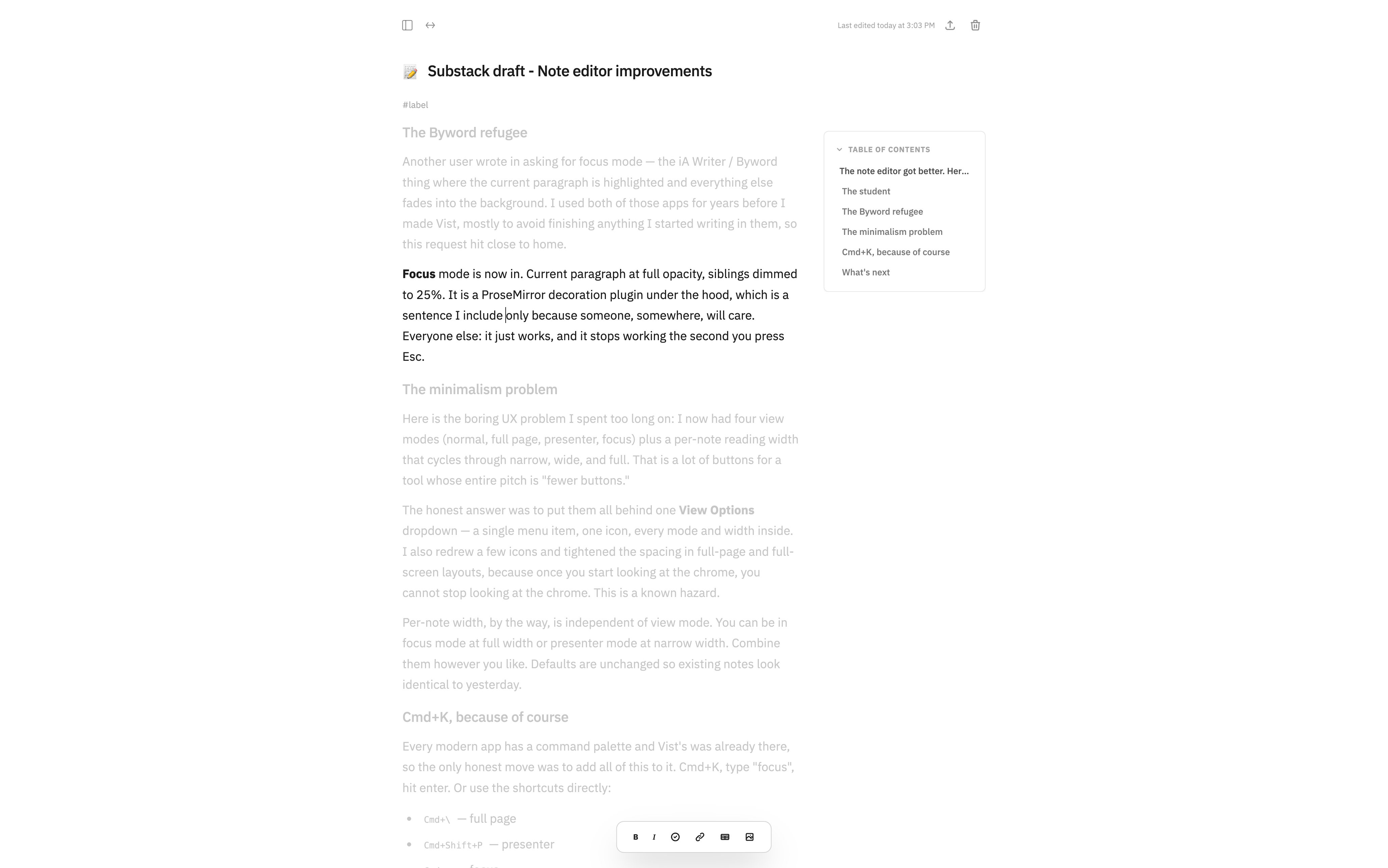
Another user wrote in asking for focus mode - the iAWriter / Byword thing where the current paragraph is highlighted and everything else fades into the background. I used both of those apps for years before I made Vist, mostly to avoid finishing anything I started writing in them, so this request hit close to home.
So yeah, Focus mode is now in. Current paragraph at full opacity, siblings dimmed to 25%. It is a ProseMirror decoration plugin under the hood, which is a sentence I include only because someone, somewhere, will care. Everyone else: it just works, and it stops working the second you press Esc.
The minimalism problem
Here is the tiny UX problem I spent too long on: I now had four view modes (normal, full page, presenter, focus) plus a per-note reading width that cycles through narrow, wide, and full. That is a lot of buttons for a tool whose entire pitch is “fewer buttons than Notion.”
The honest answer was to put them all behind one View Options dropdown: a single menu item, one icon, every mode and width inside. I also redrew a few icons and tightened the spacing in full-page and full-screen layouts, because once you start looking at the chrome, you cannot stop looking at the chrome. This is a known hazard.
Per-note width, by the way, is independent of view mode. You can be in focus mode at full width or presenter mode at narrow width. Combine them however you like. Defaults are unchanged so existing notes look identical to yesterday.
Cmd+K, because of course
Every modern app has a command palette and Vist’s was already there, so the only honest move was to add all of this to it. Cmd+K, type “focus”, hit enter. Or use the shortcuts directly:
- Cmd+\ (full page)
- Cmd+Shift+P (presenter)
- Cmd+. (focus)
- Esc …back to normal (and yes, it is smart enough not to steal Esc from inputs and modals, which I learned the hard way)
What’s next
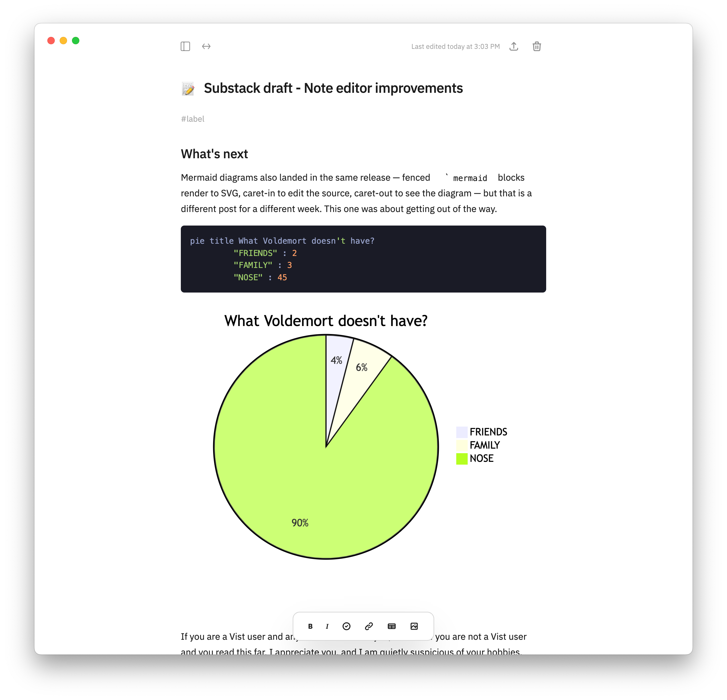
Mermaid diagrams also landed in the same release — fenced ` ```mermaid ` blocks render to SVG, caret-in to edit the source, caret-out to see the diagram — but that is a different post for a different week. This one was about getting out of the way.
If you are a Vist user and any of this breaks for you, tell me. If you are not a Vist user and you read this far, I appreciate you, and I am quietly suspicious of your hobbies…